Again, the left panel contains the navigator pane (a smaller version of your image) as well as access to the presets (previously seen in the quick develop pane of the Library module) and image change history. One cool thing about the navigator is that it allows you to preview changes while your mouse is hovered on the tool, before you click. This works well with the presets to see if you’re choosing the one you think you are. The navigator also lets you select the zoom of the view in the center panel and if that is larger than the screen allows, lets you… navigate… the image by scrolling around the smaller version.
Sliders are restricted to their own ranges indicated by the shaded area.
The center panel contains some basic tools for cropping, spot removal, and red-eye correction as well as the working version of the image. Cropping is a little counter intuitive in that when you rotate to crop, you’re actually rotating the image to the crop rectangle instead of rotating the crop rectangle to the image (ala Photoshop). It takes a little getting used to, but is more of an annoyance than an obstacle. On the plus side, the cropping rectangle includes a built in “rule of thirds” grid, making composition even easier than before. The spot removal tool also allows you to apply the same spot removal selections too multiple images at once. This is great for removal of lens or sensor dust on images from the same shoot – or constant hot pixels in your camera’s sensor.

Adjust the curve and sliders by clicking and dragging on the photo itself.
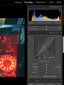
The Develop module’s right panel is the workhorse of Lightroom and is designed with a top-down mindset in the order Adobe feels you should work on your images. The histogram is ever present at the top and has indicators to show when you’ve blown out shadows and highlights. The Basic pane lets you set the white balance, tone settings, and what Adobes calls “presence” with clarity, vibrance and saturation sliders. What’s cool is that rather than working on the whole image, the tone sliders here are constrained intelligently to their assigned areas. The Blacks sliders are limited to the low end darker colors, while the Fill light slider concentrates on the shadows.
White balance is a bit misleading as well, in that while the “White Balance” is being set, you aren’t doing this by selecting what is white (or black), but selecting only a neutral color (one where red, green, and blue values are nearly equivalent). Lightroom alters the photo’s balance accordingly and does so quite well.
The next pane down is the Tone Curve – similar to Curves in Photoshop. These four sliders (Highlights, Lights, Darks, and Shadows) let you modify the curve of your image and again are constrained to affecting a specific range. This is ingeniously shown on the curve as you work on each slider. There is a round button in the upper left of the pane that almost goes unnoticed, but when you click it, it allows you to adjust the curve and sliders by clicking and dragging on the photo itself. So rather than guessing which slider would affect that palm tree, drag on the palm tree until you get it looking the way you want. Just make sure you turn it off when you’re done!
Next stop on our hit parade is the Hue/Saturation/Luminance pane. As the name implies, this allows you to adjust the effect of eight different colors and combinations in your image. Again, the on-photo editing button is present and this is invaluable for this pane.